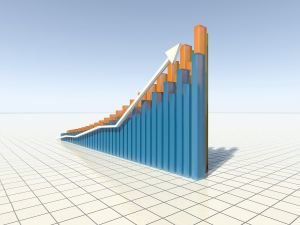
What are the Advantages of Data Visualisation

The modes of information communication evolve constantly in order to improve its efficiency, clarity and aesthetic appeal. Generally, there are no wrong ways to communicate information but the traditional textual forms are slowly giving their way to data visualisation. Whether the latter is really the best way to communicate information or not depends on several factors including the type of data you want to present and the target audience to which you are communicating information.
If you are having difficulties deciding between communication of data in the “raw” form or using visualisation methods such as graphs, dials, charts, etc. instead, the following overview of advantages of data visualisation may help:
Clarity. It is a lot easier to understand a dial or graph than numbers. The viewer understands what you are trying to say at a first sight. Saving time. Since a “picture is worth a million words”, using data visualisation helps the audience quickly absorb and interpret the presented data. As a result, data visualisation enables you to present a considerably larger amount of data in comparison to the textual format which often requires repetition in order to help the audience understand the information. Less confusion. It is not difficult to get confused when dealing with lots of numbers as you actually need to memorize them to be able to understand the communicated information. Using visual presentation of numbers, however, dramatically reduces confusion because the audience does not need to process the numbers to be able to see where you are going. Aesthetic appeal. Visualisations look better and attract more attention than the textual format. They are also more likely to keep the audience interested in your presentation.
Although data visualisations are easier to understand and look more attractive to the audience, it is crucial to achieve a perfect balance between visual appeal and functionality. Data visualisation is in the first place used to improve efficiency of the communicated information. A beautiful presentation which, however, fails to emphasise relevant data or is not clear enough is of little value. For that reason it is highly important to make sure that the presented data are clear and understandable, and only then focus on aesthetically appealing and attention drawing design. Just as important is to support the communicated information with additional materials such as official statistic data, facts, examples, etc. if you want the audience to accept your view/interpretation.
In the end, it is necessary to mention that the use of data visualisation does not necessarily exclude the textual format or vice versa. If you are dealing with numbers, you cannot avoid them completely no matter how sophisticated visualisations you use. Nevertheless, it is a lot easier to make a point and help the audience understand the importance of the communicated information if you also use visual presentation along the numbers.